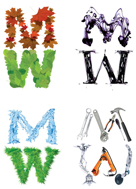
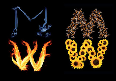
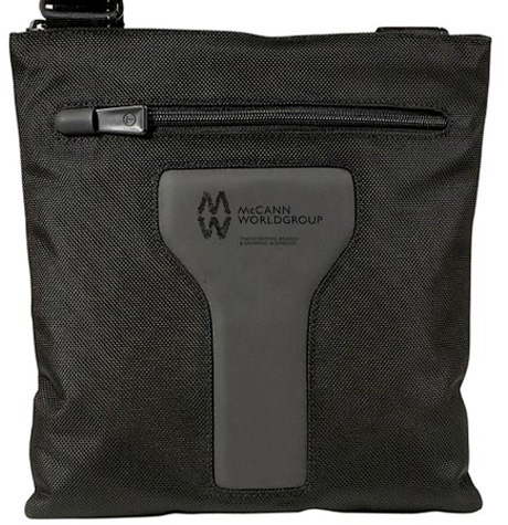
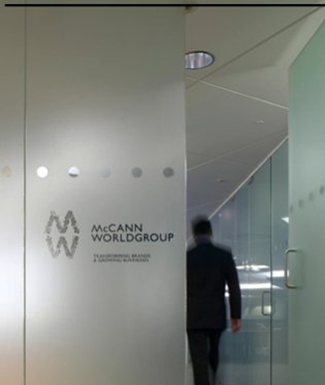
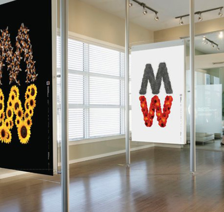
Creativebits.org

an All Creative World site
Ivan's picture

New McCann Worldgroup identity

McCann is one of the world's largest advertising agency networks. Here is their new identity designed by Futurebrand.

Commenting on this Blog entry is closed.

YoungZM's picture
908 pencils

I like how versatile it is for sure, the action shots definitely help.

www.jackmancer.com's picture
547 pencils

Logo reminds me of Unilever, which has heaps and heaps of elements as well, kinda breaking rule #1, keep it simple. I kinda like it and can see what they aimed for, but the M is not exactly an unique shape, if they had a unique shape it would be kinda cool to make it out of different objects every time like they do now.

Oh and sometimes they use a different M, I think that's a bit weird.

Art D. Rector's picture
3131 pencils

Bet it was hard to keep a straight face when they presented that one.

I salute them for having the guts to run with it, and it will be a fun logo to play with for the first year or so... However - as you can see where it's etched into the glass - it simply doesn't work very well once you take away the motion and the color.

JMHO.

YoungZM's picture
908 pencils

The variation could be the regular font on the glass (it isn't here obviously) with the fun play applied to it. That would be just as important to show now that I think of it.

qwertyale's picture
2046 pencils

yes I'm brazilian xD

kevin9794's picture
135 pencils

hahahaha agree @qwertyale and @Art D

looks good on the website... but the glass just seems dirty.

krisM's picture
86 pencils

Yucky!

wgzn's picture
2109 pencils

i think my mom could have done as good a job on that logo...

it sucks to see all these historically good shops, turning into big piles of trendy dog-shit.

: (

Craig Michael Patrick's picture
64 pencils

This isn't much to my taste in terms of logo design. But like most pieces of art, it's important to find the positive take-aways. My thoughts:

  • Far too many shapes, though I'm not opposed to a gestalt approach in word marks
  • The color palette seems excessive to me as well, though I do quite like the extensibility of the logo in different iterations. AOL tried a similar approach in their last logo redesign and this treatment seems vastly superior in recognizing form manipulation is a plausible approach to logo design
    • The subtext of this communicates to me a company philosophy of flexibility - a good thing from a PR standpoint
  • That said, I agree with Antoine de Saint-Exupery who very eloquently stated:

    "You know you've achieved perfection in design, not when you have nothing more to add, but when you have nothing more to take away."

Craig Michael Patrick
http://cmpatrick.com

taba's picture
163 pencils

You know, if this were in the critique section of this website, posted by someone just starting out, we'd hear (and rightfully so):

1. This is not a logo. It is an illustration.
2. It will not reduce well at all.
3. Does it work in black and white?
4. What is the purpose of this? The concept? Does it really say anything about your business?
5. What is with all of the iterations of the logo? Keep it simple. Brand unity etc etc.

That window looks terrible. I know it has been said, but it needs to be said again.

Why is it perceived as "brilliant" when some big agency does it? And does anyone else find it funny that McCann's tagline contains the words "Transforming brands" when they hired someone else to do their own??

The whole design world is so fickle. I'm just feeling cranky this morning. I need a nap.

btw, qwertyale, you rock.

wgzn's picture
2109 pencils

i dont think its brilliant. i think it sucks monkey balls.

taba's picture
163 pencils

+1000!!!

Best critique ever!

taba's picture
163 pencils

Ok, update to previous rant:

I see that Futurebrand is part of McCann. Sorry about that.

steveballmer's picture
647 pencils

hmmm

http://stevefakeballmer.wordpress.com
I am not Steve Ballmer pretending not to be me!

bocciaman's picture
78 pencils

Somebody had a little too much fun with Adobe Photoshop and Illustrator.

-A.B.
Inside That Ad
http://www.insidethatad.com/

macguazu's picture
4 pencils

mac CAN make a better logo!!!...........

mcevoy's picture
1 pencil

a lot like the levers logo,but looks dated already.sorry guys get the bill in quick.

kakuei's picture
2 pencils

first impression: unilever. trendy but not better. is that an inverted gill sans W for the logotype?

NewBusinessHawk's picture
1 pencil

What a tragic logo for the once proud name McCann to be associated with!

An agency brand needs to address the challenges in the market place while providing focus for new business: how to describe your firm, what services to offer, and even what organizational structure works best. If you understand who and what you are, a clear agency brand provides discipline for the agency’s new business program. This helps you identify which prospects to go after and which prospects to pass on.

What/who is this targeting?

While the marketplace has become more tactically driven and project-based, many traditional agencies have not adapted their organizations and services to match the needs of the client.

To be effective and profitable your agency needs to present itself in a manner acceptable and appropriate for the circumstances.

Do you see your agency as a tactical project "fun" high energy creative shop, or a strategic based idea driven business building partner? Given the highly fractured marketplace attempting to be both is confusing and often results in the firm being lumped in with the project based shops.

So what does this logo say to prospective clients?

Bob Sanders
Sanders Consulting Group
Blog: http://sandersconsulting.com/newbusinesshawk/
Twitter: http://twitter.com/newbusinesshawk

twisty's picture
9 pencils

it's a logo for a Celtic band isn't it?

adp's picture
1 pencil

Messy Work.

Have to agree with Bob, McCann was always about focused strategy led work and their planning tools are among the best, simple and focused.Sad to see that they want to look like a creative hot shop, trying to be trendy to fit in with the times.

Also forget the brand personality and the basics of logo design. This looks like a mess in BW. Really Future brand what were you guys thinking.

ace85le's picture
33 pencils

Application is gonna be a major pain.

Scorch Identity LLP | Boutique Brand Consultancy | Logo, Brochure & Website Design | Branding Packages

www.scorchidentity.com

Creativebits is a blog about creativity, design and Macs. We also have a critique section where you can post your work to get opinions and a forum to discuss any design related topics.

Recommend us on Google

Latest critique

Do you need a great new logo?

If you need a logo for your company or product you can get it done with us.
In our logo store you can pick from over 28,000 pre-made logos that will be customized to your name for free or you can post a contest for us for just $250 and our designers from all over the world will submit dozens of logo design suggestions to your specific needs.

Marketplace