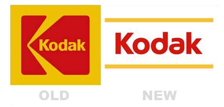
Kodak revealed its new logo yesterday. The old logo has served the company for more than 50 years and apparently they felt it was time to change.
The new logo certainly has a young and fresh feel, but I’m afraid it has lost it’s character. The old one wasn’t great, but it was certainly distinct.
I liked the masculine boxy and bold look of the old logo. The new logo doesn’t have a logo symbol to make it memorable, like the arrow in the old one. Only the rounded letter “d” makes it somewhat special.
Keeping the colors was a good idea. The only undisputable positive change about the new logo is that it has much bigger contrast than the old one. A red logotype almost always works.
I predict the two yellow lines are going to be dropped within a few years in a similar way as VISA lost the blue and brown bands.
What do you think? Was it good move on the short and the long term?
