New Starbucks logo announced
www.jackmancer.com (547 pencils) | Wed, 2011-01-05 22:16
Starbucks announced their new logo just a few hours ago and already some people hate it and some others love it. Some are pointing out the logoflop GAP made last year - some do appreciate it for it's elegance and simplicity. I really do like it, the old one did indeed look dated, specially next to the new one.


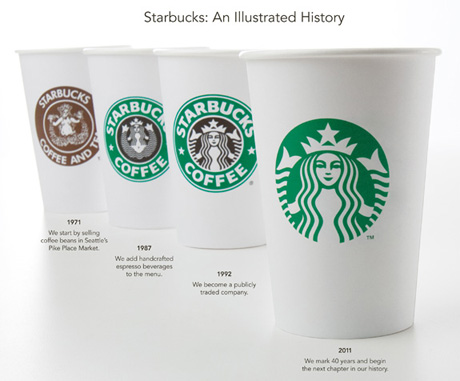
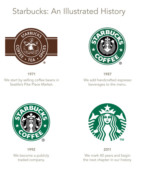
The new logo should be used from March this year.
Thoughts?
Commenting on this Forum topic is closed.

I think it's a fine evolution of the logo. People will warm up to it when the full identity is rolled out.
Without my sense of direction, I don't know where I'd be.
I love it. Like it when typo can finally be removed.
Also like (not love) it and agree with the previous points - but is this really a "new" logo? They didn't even need to hire a designer here - they just removed the outer ring. At least the Gap actually rolled the dice. ;-)
removing of type ≠ new logo.
starbucks is the second biggest joke being played on the world. "web 2.0" being the first
Startbucks is now one of he famous and popular coffee shop.
I like the new one logo.
I like the new revision, looks cleaner..
When Starbucks first started in Saudi Arabia, they had a totally different logo.. I found one through Google Images:
http://zained.files.wordpress.com/2010/04/img_7315.jpg
Their standard identity is now being used. (Edit: except Makkah, as informed by a friend)
http://twitter.com/65WZ
Very interesting. Was the mermaid against Islam?
The problem was the sign of breast/nudity if I remember correctly.
http://jackmancer.com/
http://twitter.com/jackmancer
You remember correctly, Jack.. It's exactly the reason.
There are certain guidelines that govern outdoor signage & advertising, although it surprisingly varies from one city to the other.
http://twitter.com/65WZ
Wow, that's incredibly interesting. imagine having to create a diffrent logo for your company for each region you operate in.
Leaky Penny
Check out what I've been up to lately!
http://petersonjoseph.com
I'm going to print it out and eat it.
-Unknown Artist
Well in my opinion the logo is definitely new. Just like car models, a "new" logo can be an update of it's predecessor. And looking at the Starbucks Facebook page it really made some reactions. http://www.facebook.com/Starbucks?v=wall
Nice image Waleed :) Yes I remember Starbucks had some different versions of their logo in order to be appropriate to different cultures.
http://jackmancer.com/
http://twitter.com/jackmancer
Why couldn't I have been the graphic designer for THAT job? Man, I bet they got paid big bucks just for enlarging the mermaid. :sigh:
It's still a job well done in my opinion. There is a quote about modern art that suits this as well:

It's actually more difficult than you think. I suppose a lot of research or testing or whatever has done before the choice was made to drop the company name. Also, the scissor (leaving things out) is often a more difficult tool then the pen (adding things).
http://jackmancer.com/
http://twitter.com/jackmancer
Love the equation - and it applies to much of the work of design.
Also agree about removing things being more difficult than adding.
I think this is a nice evolution, but the story I'd love to hear is the internal one - how the company (and board) were persuaded to accept the removal of the text, and to accept what, to them, is probably a far more massive change than it appears to us.
I think Starbucks wants to deliver more products/services than coffee and muffins, etc, hence the "COFFEE" had to go. And I believe they also want to be in the same league as Apple and McDonald's, who's logo's work without a name as well (the apple and M).
http://jackmancer.com/
http://twitter.com/jackmancer
I think you are right. I'm guessing that if you asked someone to draw the Starbucks logo from memory they'd look a little lost - give this version a year and try again and you might have better luck.
Finally looks modern. Ill miss the brown, but it actually looks better without it.
Pretty funny, a guy named Felipe Torres made this ;p

http://jackmancer.com/
http://twitter.com/jackmancer
Reminds me of the movie Idiocracy. :)
I like the new logo as well, but is the mermaid image identifiable with the Starbucks brand? As a consumer, I identified more with the name, and the image (gasp!) was almost secondary to me. As a designer, I feel like I just stabbed myself in the back...
starbucks = illuminati
yes I'm brazilian xD
"They didn't even need to hire a designer here - they just removed the outer ring. At least the Gap actually rolled the dice."
UGH! This is EVERYTHING that is wrong with attitudes towards corporate identity today. Your forefathers would never have done that to The Gap or Tropicana.
A little less desire to steamroll the client into what YOU want and a little MORE respect for their brand identity.
Logos should EVOLVE, not get wiped off the face of the map and start from scratch.
This is an example of logo evolution done right. Thanks goodness someone still has a good head on their shoulders.
I think there is a tendency to see design as a revolutionary force creating incredible, mind-blowing new things. But I think that we, as designers are (or can be) partly to blame for that. It is much easier, quicker, and more exciting, to explain and sell design as revolutionary and new than as evolutionary and as 'problem solving'. If you look at most portfolios you can see this. I'm battling with my own portfolio at the moment in an attempt to show the more thoughtful, strategic side of design, and it is a battle.
So, given that we often present ourselves in this way, it isn't suprising that this shapes peoples expectations.
I actually liked the typography in the logo more than anything else. But then I'm just a huge fan of typography. It doesn't seem like much of a change, but it really is, and it is a good evolution right on par with their branding. People will still see one of their iconic cups from far away and immediately recognize it as a Starbucks cup, even without the typography "seal".
Lots of blowback on the Gap remark. Hey it was a joke, but obviously it had a ring of truth to it or you folks wouldn't have reacted in such a way. I like the new one, but Starbucks obviously took the safe route. Did they "update" the logo? Sure. Another baby step - as illustrated by the "Future" work someone else did up above. So let's not pretend like this is some bold new vision for the company - it's (more or less) the same mark.
One thing that's missing from this thread - and will be interesting to see - is how they handle the name when they actually have to run it with the new mark. Because they can't run it naked ALL the time. Do they take the safe route again and wrap it around the new mark similar to the old mark? Hmmmm....
Bold new vision? Nah, it's a refresh, an update no more no less.
The Gap, on the other hand...copious amounts of alcohol was involved in that one.
Leaky Penny
Check out what I've been up to lately!
http://petersonjoseph.com
I'm going to print it out and eat it.
-Unknown Artist
Somewhere I've got a starbucks ID manual, and it's a pretty impressive (in terms of communicating rather than page count) document which makes clear that the visual ID spans shops, kiosks, in-store art and more products than you could imagine. With that in mind I suspect that the logo re-work is just the tip of the 'bold new vision'.
Jack Trout (marketing guru) said it's a wrong move by Starbucks - they don't have the same recognition Apple's logo has or McDonald's M, so it won't work as good as those without a name. Makes sense.
http://jackmancer.com/
http://twitter.com/jackmancer
Maybe this was the reason why they want the brandname out of the logo ;p

http://jackmancer.com/
http://twitter.com/jackmancer
The type apparently got dumped because Starbucks will be moving into product categories that have nothing to do with coffee. Judging from comments on Starbucks' blog, current customers aren't that thilled by the new logo.
I think Vootie might be right. With the additions of the artisan breakfasts and the many different food items as well as all the odds and ends that clutter the front of the store but the blog was also talking about the worldwide applications of the logo. Which backs up Waleed's comment.
Also, I think a lot of the negative feedback to the logo maybe coming from those whom are afraid of change. (Not all but a lot) I like the new logo, though I am a little sad to see the black go. I guess i liked the contrast of the 2 colors.
I hate it!
http://stevefakeballmer.wordpress.com
I am not Steve Ballmer pretending not to be me!
Starbucks coffee always favorite. New logo looks nice, clean and out of the box. :)
Clipping Path | Clipping Path Services | Clipping Path Blog | Image Editing Company
I like it!
About time someone gave Isis a make over, the poor love.
Graphic Design Manchester
Interesting post. Thanks for sharing this information.
Logo Design
Brochure design
Banner design
It would be better as well that they take away those claws.