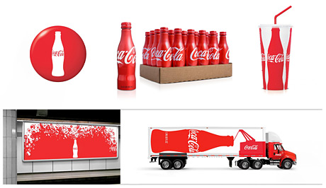
The new Coca-Cola visual identity system designed by Turner Duckworth, London & San Francisco took home the very first Design Grand Prix at Cannes, France today. Over the years Coke’s visual identity had become cluttered and uninspiring, diluting the brand’s iconic status. The design studio clarified the identity, then injected a little fun into everything from cups to trucks.
I work a lot on Coca-Cola branding and I welcome this change with open arms. I always thought simplicity will be refreshing for Coke. This new identity gives opportunity for creativity while leaves the overall look clean and simple.


Comments are closed.