Introduction
Welcome to our comprehensive guide on understanding the creative colorwheel. In this article, we delve into the intricacies of colors, their relationships, and their significance in the world of art and design. Whether you’re an aspiring artist, a seasoned designer, or simply curious about the captivating world of colors, this guide will provide you with a wealth of knowledge to enhance your understanding. So, let’s embark on this colorful journey together!
The Basics of the Colorwheel
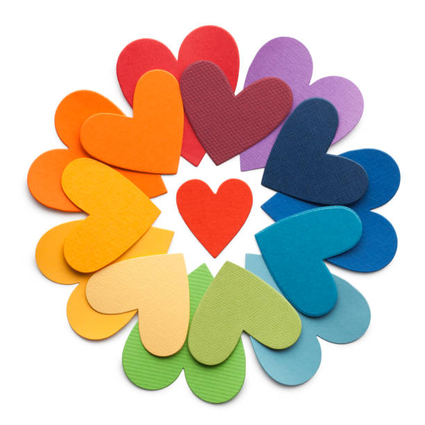
At the core of understanding colors lies the colorwheel, a visual representation of the spectrum of hues. The colorwheel is divided into twelve segments, each representing a different color. These colors are arranged in a harmonious order, allowing us to explore their relationships and interactions. The primary colors—red, blue, and yellow—form the foundation of the colorwheel, while the secondary colors—green, orange, and purple—emerge from their combinations.
The Power of Primary Colors
Red: Passion and Energy
Red, the color of fire and blood, evokes powerful emotions such as passion, love, and excitement. It grabs attention and demands to be noticed. In art and design, red is often used strategically to create focal points or convey intensity. Think of a vibrant red rose standing out against a sea of green foliage—a perfect example of the visual impact red can have.
Blue: Serenity and Tranquility
Blue, the color of the sky and the ocean, exudes a sense of calmness and serenity. It symbolizes peace, stability, and reliability. In creative endeavors, blue is commonly employed to evoke feelings of tranquility and introspection. Imagine a tranquil painting featuring a serene seascape or a soothing blue background in a website design that promotes relaxation.
Yellow: Warmth and Positivity
Yellow, the color of sunshine, radiates warmth, happiness, and positivity. It stimulates the mind, encourages creativity, and is often associated with joy and cheerfulness. Artists and designers utilize yellow to add vibrancy and optimism to their creations. A vibrant yellow accent in a piece of artwork or a playful yellow logo can instantly uplift the mood.
The Magic of Secondary Colors
Green: Harmony and Nature
Green, the color of nature, represents harmony, growth, and renewal. It is associated with freshness and balance. When combined with other colors, green has the ability to create a harmonious visual experience. Picture a lush green landscape with a variety of plants and flowers—green serves as a unifying force, bringing the elements together.
Orange: Energy and Enthusiasm
Orange, a color that combines the vibrancy of red and the warmth of yellow, radiates energy, enthusiasm, and creativity. It stimulates excitement and encourages social interaction. In art and design, orange is often used to create a sense of vitality and playfulness. Imagine a bold orange logo representing a dynamic and forward-thinking brand.
Purple: Royalty and Mystery
Purple, a color associated with royalty and luxury, exudes elegance, sophistication, and mystery. It is often regarded as a color of creativity and spirituality. In the realm of art and design, purple is frequently employed to add a touch of opulence and intrigue. Think of a regal purple velvet fabric or an enchanting purple-themed interior design.
Exploring Color Relationships
Understanding how colors interact and complement each other is crucial in creating visually appealing compositions. Let’s explore a few key relationships:
Complementary Colors
Complementary colors are situated opposite each other on the colorwheel. When combined, they create a strong contrast and enhance each other’s visual impact. Examples of complementary color pairs include:
- Red and Green
- Blue and Orange
- Yellow and Purple
Analogous Colors
Analogous colors are adjacent to each other on the colorwheel. They share similar undertones and create a harmonious effect when used together. An analogous color scheme can evoke a sense of unity and coherence. For instance:
- Blue, Blue-Green, and Green
- Red, Red-Orange, and Orange
- Yellow, Yellow-Green, and Green
Triadic Colors
Triadic colors form a triangle on the colorwheel, creating a balanced and vibrant color combination. This relationship allows for creative and eye-catching compositions. Some triadic color combinations include:
- Red, Yellow, and Blue
- Orange, Green, and Purple
- Yellow, Blue, and Purple
Applying Color Theory in Art and Design
Understanding the creative colorwheel and color relationships empowers artists and designers to make informed decisions when creating visually impactful works. By utilizing colors strategically, you can evoke specific emotions, guide the viewer’s attention, and convey your intended message effectively.
When applying color theory in your artistic or design endeavors, remember the following:
- Consider the emotions and associations tied to each color.
- Leverage the power of color contrasts to create focal points and visual interest.
- Explore various color schemes, such as complementary, analogous, or triadic, to achieve different visual effects.
- Keep in mind the context and purpose of your artwork or design, aligning the color choices with the intended message.
Conclusion
Congratulations! You’ve embarked on a colorful journey through the depths of the creative colorwheel. Armed with a deeper understanding of colors, their meanings, and their relationships, you now possess a valuable tool to elevate your artistic and design endeavors. Remember, the key to mastering color lies in practice and experimentation. So go forth, embrace the beauty of colors, and let your creativity soar!
Also, check the posts on where to get search icons, how to create search icons, user icons in digital interfaces, how to use user icons, where to get user icons, and where user icons shine.


Comments are closed.