
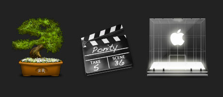
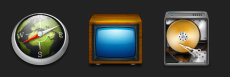
Here is an interview with the talented icon designer Jonas Rask from Denmark. Hopefully you will find it useful to have a bit of insight into his professional thinking and get to know him a bit better personally as well.
When I stumbled upon Jonas work some time ago on the net. I particulary fell in love with his highly detailed icons and the complexity of them. I wanted to know more about who he is and how these icons were created so I’ll just had to ask him if he was willing to give an interview. Luckily he was more than happy to do the interview so here it is:
CB: Hi Jonas! First, I’d like to ask you what’s your working process? Most importantly, how do you come up with a concept for your icons?
JR: I don’t draw freehand, cause I simply lack the skill to draw anything remotely usable with a pencil. But I have a pretty visual way of thinking, so what I imagine in my head I just draw that shape into photoshop. Then once the shapes are all set, with primitive greyscale lighting, then I start coloring, making textures, details etc.
CB: How did you get started designing icons?
JR: I started getting annoyed that I could not find the specific icons that I needed for certain programs. I then decided that I might try out designing my own stuff. I guess it just took on a life of its own, cause I was having so much fun drawing so I spent many hours just learning.
CB: What inspires you? Can you recall when was the last time you felt inspired?
JR: It can be anything really. From walking through town, seeing a cool object, going home and try to draw it. I also get inspired from various trends in the mac community, taking elements and colors from various websites and user posted screenshots. Then there’s the drive of keeping to improve my skills. That is a huge motivation factor for me. Improving technically.
The last time I felt inspired was yesterday. I saw a program that had REALLY bad toolbar icons, so I decided to give it an overhaul.
CB: What is your favourite aspect of the design process?
JR: Finishing touches. It’s really the part of the process where the detailing makes the icon come alive. I care a lot about the little things. so making everything as perfect and detailed as possible is very appealing to me.
CB: In your opinion, what are the critieria of a successfully designed icon? What’s the most important thing one should look for?
JR: How it blends! Very important to make the icon be part of a whole. Also the individual icon should send a very clear message of what’s it’s purpose. Metaphors must be clearly visible to everyday users, not just the powerusers.
CB: The upcoming Mac OS X Leopard (10.5) will support icons that are 256x256px in size. Do you think this is a good trend? Is there a need for bigger icons?
JR: Well it’s a natural development really. Screens will soon support much higher resolutions than the 72 dpi, so when screens with new higher pixel density shows up we have to be ready. I have been designing a lot of my icons in 512 x 512 before even knowing that leopard would make use of that size. Plus there’s just something crazy cool about big icons. (http://jonas.seph.ws/.el/iChat.png)
CB: What was the toughest icon design job you ever had? What did it entail?

JR: The Docuteam icon set was hard. They wanted BIG icons, but they didn’t just want them scaled. They wanted to use them in full size for presentation purposes. That meant having to do an insane amount of detailing on each icon. It was fun, yet very challenging and time consuming.
CB: What advice would you give to aspiring icon designers?
JR: Listen to other more experienced designers’ advices. Don’t be too proud to let someone else completely take your work apart. That is the single most effective way to learn. I has helped me a lot, and still does. Other than that, just go for it, and have fun doing it.
CB: What type of music do you listen to when you design?
JR: Very different from one session to another. It usually depends on what music is important in my life at the time.
CB: What hardware, OS and tools do you use in your daily work?
JR: I use a 20″ iMac Core 2 Duo with 2 gigs of RAM as my main machine, it’s running OSX, and my designer tools are photoshop and iconbuilder tools by the iconfactory.
CB: Do you have a trick or tip to share?
JR: Make sure to perfect your lighting! It’s SO important for an icon to look real. And don’t be afraid of harsh contrasts.
You can find Jonas website here: http://jonas.seph.ws/