
Your business card says a lot about both you and your company. While boring, standard-size cards are the norm, using a unique design can help you make a lasting impression. Here are ten ideas you can implement to make your business cards stand out from the herd!
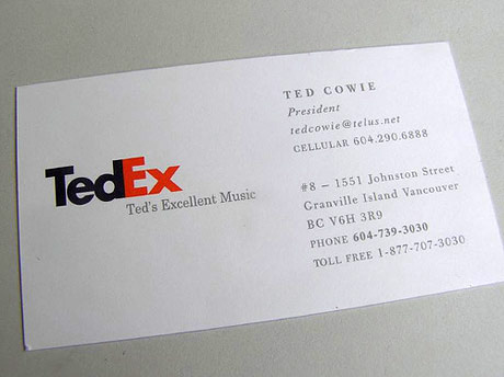
10) Spoof a Famous Logo. Why go with a boring font? In the example below, ‘TedEx’ is both memorable and slightly humorous. Using image manipulation software and some creativity, you can create your own custom logo spoof that potential clients are less likely to forget. To avoid legal trouble, spoof a company that has no overlapping clientele. This avoids the issue of misrepresentation.
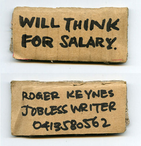
9) Go hobo! Who says your business cards have to be polished squares of perfection? While you may not want to try this approach if you’re an upscale interior designer or work in a conservative field such as banking or real estate, construction companies, artists, writers, and urban renewal firms could make a bold impression with this style.
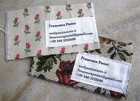
8) Incorporate unusual mediums. Who uses standard card stock? Seemingly everyone everywhere. In the example below, a seamstress uses swatches of cloth to make her point. Anyone who works in tailoring, alterations, fashion, or upholstery can make a similar statement. No one will forget what you do with this style of card!
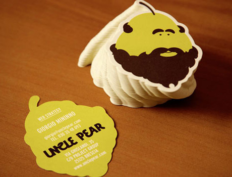
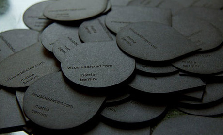
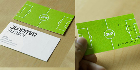
7) Square is for squares. Die-cut paper can tie your name to your product without resorting to spelling it out. Where it’s a row of teeth for dentists, a heart for a match-making service, or the rough edge of a saw blade for a carpenter, fun shapes can help define your brand.
6) Make it do something. In the design below, a coffee entrepreneur could leave these cards at her competition’s coffeehouse undetected, and there is no question as to what she does. Don’t be afraid to invent a card that can serve as a coaster, a bookmark, or other useful item. The more people that see your name and the name of your business in print, the better.

5) Make it short and sweet. Some of the most inventive business cards simply have the company name and a phone number. Be honest, how many first-time clients use email or a fax machine for an initial contact?
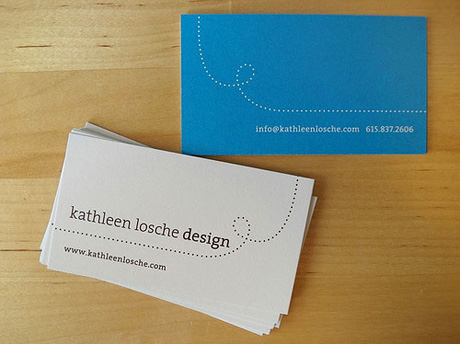
4) Be bold! White. Ecru. Off-white. Ivory. Beige. Snooze. If your business is splashy and fun, choose a bold color to convey that feeling. Play around with different colors.
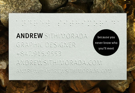
3) Speak to your audience. If you work with the sight impaired, shouldn’t your business card include Braille? If you do business in several languages, address the reader in their native tongue.
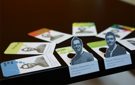
2) Show, don’t tell. If you’re a photographer and your business card is all text, shame on you! The same goes for designers with boring cards. If you work in the public eye as a speaker or trainer, your mug needs to be on your cards. Don’t just tell your potential clients you can do something, show it!
1) Keep it readable. This is the cardinal rule of business cards. If your clients have to strain to see the typeface, they might just move on to Google or the yellow pages to find someone whose contact information they can read.
Business cards allow you to make a lasting impression on potential clients. Don’t be caught with boring cards. Design a masterpiece you are proud to distribute.
My name is Nisha Sharma and I work with the Editor of offices.org.uk. Feel free to visit our site for more information on serviced offices.
Comments are closed.