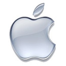
 For decades designers were told to avoid the use of more than 3 colors in a logo. This trend was broken in the mid eighties by Apple launching their famous rainbow apple logo. Then we were told to avoid gradients. 20 years later Apple was among the first to break the rule again by launching their shiny trendsetting aqua Apple logo.
The reasoning against gradients was strong, but it is not valid anymore. The printing costs for 4 color process was more expensive than just two direct colors. The widespread digital printing which is primarily based on cmyk printing eliminated this problem. High quality full color printing is not expensive anymore even at small quantities (like 50 pieces of business cards).
Online branding has become more important for companies than printed materials. Most company logos on websites are seen by many more people than all their printed material altogether. And full color logos with gradients look great on screen.
We can officially claim that a new era in logo design has arrived. Feel free to design logos with gradients. Naturally a good logo design should translate to a single color for special uses, ex. etching on a marble floor. But we should not limit our designs to logos that fail in black & white. The b&w test remains valid to evaluate the concept of the logo, but should not be a deciding factor.
For inspiration let’s see 30 great logos with gradients from large and small companies. Finally, let’s make some projections about coming trends in logo design.













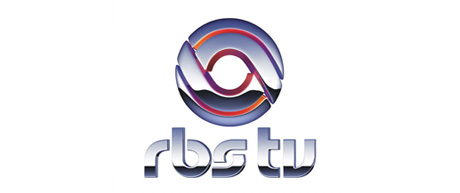
So what’s the next in logo design? I can foresee see two avenues: 3D and animated logos. These are inconceivable today but will be commonplace in 20 years or less with the emergence of new reproduction technologies.
