
In the past few years , OS X has given Apple a second whirlwind romance with public opinion. It’s software, UI effects and “just works” mojo have caused a great ripple of curiosity through previously skeptical PC users.
While the rest of the computing experience on the Mac has jumped forward the file manager used by nearly every single Mac user has puffed along by comparison.
Comparing the Finder of an old Performa chugging away on 0S 7 and Tiger’s sleek GUI, the actual functions and implementation haven’t changed hugely. So after using the Finder for a decade for media and graphic work, I’ve come to certain conclusions .
- The Desktop and Finder are two sides of the same file management coin. The best way of getting people into the bad habit of dumping files into an unrelated area. The desktop is just a folder that obscures everything else.
- The majority of time is spent navigating for folders, opening files and viewing location info.
- My desktop picture never gets seen as it’s covered with multiple overlapping windows during the normal multitasking day.
- I go to the Finder as an interruption to my workflow, not part of it. Dipping in to find a file, switching between windows, scanning through columns, expanding the window, scrolling horizontally, etc.
- Expose and Dashboard give an indication of how you can execute file and system functions in a single layer.
- I grew out of metal (brushed or otherwise) when Faith No More split up.
As an excercise in thinking through Photoshop one day. I mocked up what I would think would help someone in dealing with their information dump all day. This is one step behind vaporware as it currently exists in only in a Quicktime Movie and PDF. But that never stopped any PR department.
So Desk was born …
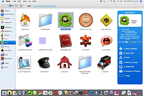
Option 1: Click for full screen image
Option 2: 3.1mb Quicktime Movie of “Desk” in action or 1.2mb PDF of the process
Desk – The Bastard Offspring of Finder and Desktop
So what we now have is a single pane which incorporates the Desktop, Finder in one layer and acommodates the Dock. Yes it’s one of those single window Finder concepts. (The horror, the horror) The Dock gets it’s own background colour preference for consistent viewing no matter what program is floating behind it.
Clicking on the “Desktop” or Desk Icon in the Dock bring Desk to the foreground as well as expanding the menubar downwards. When another program is in the foreground the Desk can dim in the same manner as Expose and Dashboard dim the background.(It could dim to a picture for those unwilling to give up their attachment to desktop pictures)
The blue “Function Bar” on the right hand side contains context sensitive functions that would change according to whether the selected item was a folder, image, mp3 etc. In terms of scrolling the scroll bars would appear on the left of the Function Bar so it is always visible regardless of how deep in the folder structure you are.

One Click and the Desktop Picture fades away
The Sidebar stays in static position on the far left of the screen. In addition to the normal sidebar file and folder shortcuts, there are three extra icons , Projects, Recent Searches and Clipboard
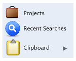
Projects – A New Concept…Almost
Most people using their Mac for business will have numerous pieces of data in emails, photoshop documents, word files etc that are related to each other.
A smart folder can do most of the legwork in gathering this info. Inching this concept forward just a tad, an Assign to Project Folder action would create an alias like a Smart Folder and automatically add the Project name to the Spotlight comments field.
Opening up a project folder would list the resources associated with the Project such as number of files, contacts and emails.
Recent Searches
Desk could contain the five most recent Spotlight searches. The same reasoning why Safari retains it’s recent Google searches.
Clipboard
Since the Desk would not spawn any new windows like the current Finder, this Clipboard folder would show items currently in memory. This could also be used as a shelf to store items before moving them on. People will initially balk at having only one layer to work with but consider why you usually have multiple finder windows open. For me I am dragging folders, copying…all work that could be made easier if I could place files to one side and then move to my destination at a time of my own choosing. Pathfinder, a Finder alternative already uses this concept of a Shelf.
So here were my aims for this were:
- Combine the Finder and Desktop into one hybrid pane of information.
- Make the conventions roughly similar to the present Finder.
- Keep options and functions out of the way until they would naturally be needed.
- Find a natural way to organise Projects.
- Make it light and easy to look at while banishing as much scrolling as possible. Take back screen real estate, especially for laptop users.
- Be easily navigable by keyboard and numeric keypad. The numbered functions make executing a function a case of looking at the list.
- Have the flow of Data be from left to right Location > Information > Function.
- Incorporate an area where files and folders can be placed temporarily until they are moved to a location. (Shelf/Visible Clipboard, etc).
- Have the Directory Structure visible at the top of the pane at all times.
- Be available at a keystroke similar to Expose and Dashboard. Show Desktop in Expose would, in practical terms, launch Desk
In my teenage years, I once spent 12 hours trying to rotate a virtual turtle in BASIC. My programming career began and died the same day on that Amstrad. My Photoshop and mockup skills are a bit better so that’s the way this virtual app currently works. As mentioned before this is one step behind Vaporware but no one has overpromised and underdelivered yet.Simply food for thought and I’d love to hear other thoughts on what would make the Finder..found.

Cian Walsh is an Icon and Interface Designer who has a Finder voodoo doll to keep it in line.

Comments are closed.