
A recent discussion sparked the idea of using LAB colorspace for transposing colors. In this lesson, I will show you why and how to do it.
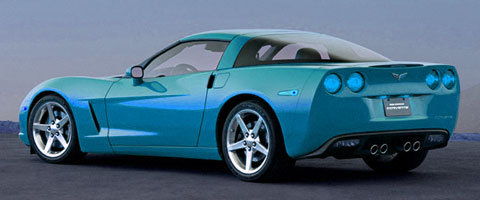
LAB color is made up of three components/channels: L, A, and you guessed it B. The lightness channel L carries all of the contrast while the color channels A (green-red) and B (blue-yellow) carry… well, the color. LAB keeps color and contrast isolated from each other, so adjusting the curves of one will not affect the other. Although a simple color shift can be done using a simple method such as HUE, major color shifts going from one side of the color wheel to the other can benefit from the power of LAB.
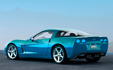
When a big color shift is made in the RGB colorspace using HUE, you can see where highlight/shadow detail is lost and compression artifacts start to show up from the lighter channels.
Convert your image to the LAB colorspace by going to Image: Mode: Lab Color.
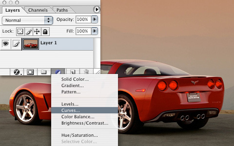
Create an adjustment layer by clicking the half-filled circle icon at the bottom of the layers palette and choose Curves.
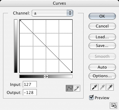
Creating a certain color other than its opposite requires a bit of practice writing curves, so in this case we are just going to turn it upside down on both the A and B channels. Do this on the A channel by dragging the bottom-left point to the top-left, and drag the top-right point to the bottom-right. Repeat for the B channel. Leave the L channel untouched unless you wish to write a curve boosting the contrast like in my attached PSD.
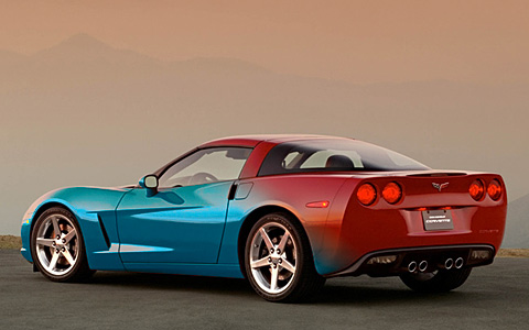
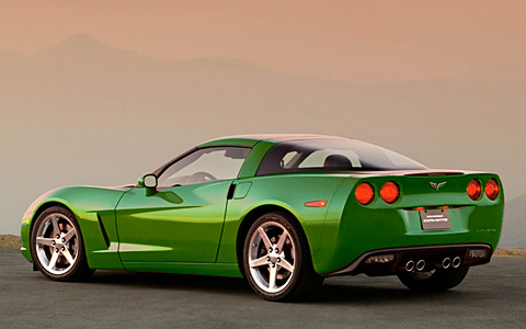
So the color on the car looks great, but what about the rest of the picture? And how come when you apply an effect to a layer, it’s called Blending Options?
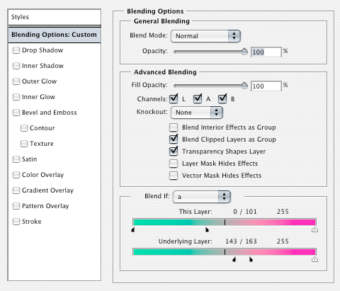
Control-Click the adjustment layer and choose Blending Options from the context menu. If you are anything like me, you completely ignore the first screen that pops up and immediately click on an effect. BUT WAIT, you see that bottom box that says Blend If? Change the channel to A and set the blending range to my example. Split the arrows apart by option-click-dragging them. This basically blends the top color to the bottom color in the range we set. Play around with the sliders, you will see it in action. Check out how the reflection on the fender keeps the color of the sky! Watch what happens if you uncheck B in the middle Advanced Blending box.
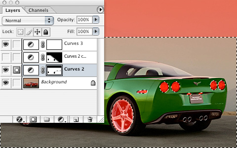
Everything is looking awesome, but because there are certain elements (brake lights) that need to stay red, some very simple masking is required. The adjustment layer already includes a layer mask. Select the elliptical marquee tool and make a selection around the brake lights and anything else you want to exclude from the color change and fill the selection black in the mask. I selected the rims also because they are actually reflecting the sky, which should be red. I also masked out the top of the sky because it turned a bit blue.
Because we are using the blend if options, there is no need for a complex mask to be drawn around any edge of the whole car!
Time to go impress your friends and coworkers. Please post your results using different variations or another picture! The original PSD is attached so you can see my curves, blending options, and mask.
| Attachment | Size |
|---|---|
| 430.15 KB |
BENLEIVIAN.com
Comments are closed.