
If you’re a Google Analytics user, you must have noticed the new interface introduced a few weeks ago. It’s mostly a visual upgrade, which is very important because the whole idea of the application is to visualize huge amount of data in a humanely comprehensible way. It also features a couple of new features that were not available in the old interface. It’s a good idea to start familiarize yourself with the new interface as the old one will be phased out starting July 18, 2007.
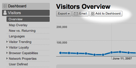
Most important new feature is the customizable Dashboard. The main landing page of Analytics is a Dashboard, which is highly customizable, just like the iGoogle. You can drag windows around, delete and most importantly add any page to it that you find interesting and check regularly.
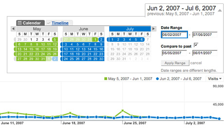
A very interesting new feature is the ability to compare timelines. By default Analytics will compare the last 30 days with the 30 days before that. I think it is better to manually set the periods to match the days of the week, because in most sites weekends are much weaker in terms of traffic. To access this feature click the Compare to past checkbox in the date range drop-down panel.
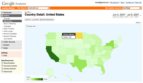
While the old interface had geographic visualization of the source of your traffic, the new one is much more cleaner with patches of colors instead of the different size dots we had previously. You can even click areas of the map to zoom in for more detail.
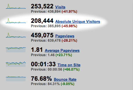
Very important new data is absolute unique visitors. Previously we only had unique visitors, which was a good indication of your readership, but not as precise as the absolute unique visitors. The problem with unique visitors was that the same person could be visiting your site twice with a 30 minute gap between page loads and it would count as two visits. This is not the case with absolute uniques. Of course there is still margin for error since the same person could be visiting from home and work and it would still count as two even in the absolute numbers. And the opposite is true. If there is one computer used by two people reading your page they would count as one instead of two.
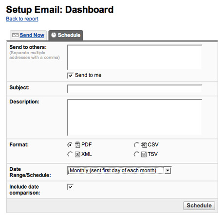
You can now easily set-up email reports about your traffic. Extremely useful time saver if you have to report about a site’s operation regularly to your boss, clients or advertisers.
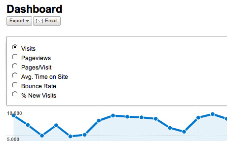
In the Dashboard main chart you can have a quick look at your site performance by different measures by clicking the drop down menu on the right.
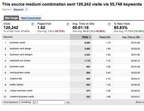
Finally a feature that is not entirely new, but very useful and relatively few people know about (because it was so hidden in the previous interface) is the list of keywords used to find your site in Google. To access it simply click Traffic Sources / Keywords.
If you were wondering why on earth Google would give you all this goodness for free — here is the catch: if you grow your site to 5M page views per month or more Analytics isn’t going to be free anymore. You can’t pay for it, but you need to be a Google AdWords advertiser. You don’t need to spend much, but you need to be a spender. Small price to pay for Analytics especially that the new Analytics is tightly integrated with AdWords, so you can precisely measure what campaigns are bringing you the most traffic and eventually get your closer to your site goal page, which can be a registration page for communities or a sale page for e-commerce sites.
Comments are closed.