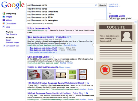
Google is testing a new cool feature Instant Previews. This allows the user to preview any webpages before clicking them by hovering over or clicking a small magnifying glass icon next to the results. This preview is not just the above the fold portion of the site, but a long page with the keywords highlighted. I expect many people will use this and therefore it’s important to consider the effect of this new service on how we design sites in the future.
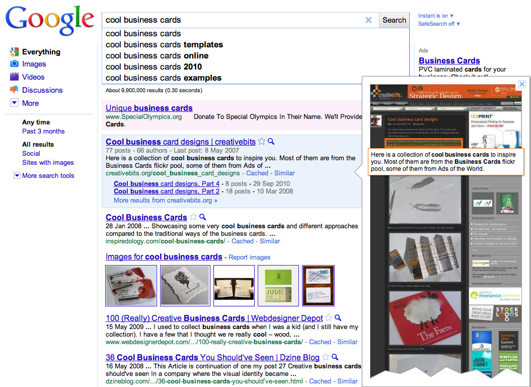
Google seems to take a screenshoot of the site at minimal width without scrolling and resizes it to an image with a width of 300px. Many users will decide on which site to click based on these preview images. Therefore for sites relying heavily for their traffic on Google searches it will be important to show a webpage design that is compelling even at that small preview size. Here is a list of things to keep in mind when designing a site optimized for Google Instant Preview:
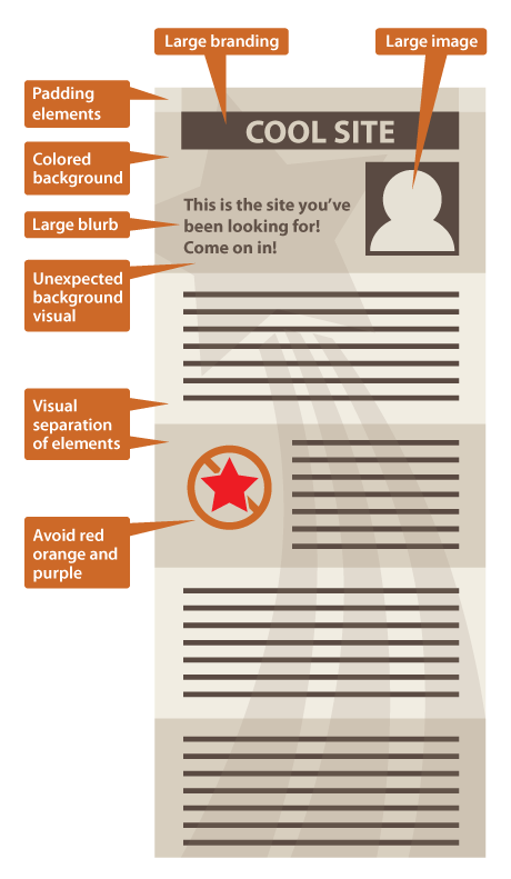
- Use large branding as much as possible on the top of the page. This is to make people see and remember your brand even if they don’t click the link.
- Make sure the site structure is as simple as possible as in smaller size it will look easier to navigate.
- Use large colorful images above fold. Faces would work best. These will grab the attention and generate more clicks throughs.
- If you can try to include large type that explains what the site is about and invites the user to click.
- Make sure the site looks good even if the whole page is visible as a long column. Visual separation of content elements by background color would work best. For example alternating background color for blog posts would create a cool stripy effect.
- The preview images tend not to have any white space on any sides. Artificially include elements that allow the page to look wider for Google, so in result the preview image generated will have some breathing space and will look neater.
- Use backgrounds that look good in contrast against the white Google search page. Light shades of warm colors would work well against the white and blue of Google’s color scheme.
- You may want to experiment with a design element that is not apparent when you open the site in a browser, but in preview could communicate an unexpected message.
- Be aware that your red, purple and orange elements will degrade in the preview image even more than any other colors. This is due to a strange problem that is always present in all highly compressed jpeg images.