
When you work with Illustrator documents your document’s background is mostly white. The interface of the application, such as the panes and the toolbox are also white by default. This puts some strain on your eyes and brain when you’re trying to identify each area. To relieve this extra effort you may want to experiment changing the background of the user interface to a shade of grey instead of white.
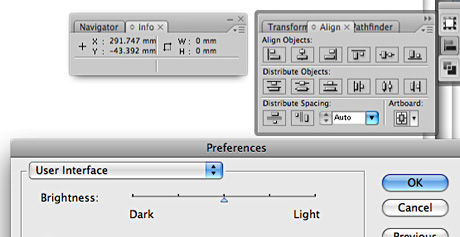
You can change this setting in Preferences/ User Interface. Don’t set it too dark as it decreases the contrast between the background and graphics of the buttons making it more difficult to see the individual functions. A good balance is a color in the middle of the slider which is a light grey.
A secondary advantage of such a setting is that you will have an easy way to tell which application is running in the foreground as InDesign and Photoshop toolbars are quite similar to Illustrator.
I know there are many who prefer complete consistency of interfaces among applications. I personally prefer a small difference between them as it helps to identify instantly what I’m dealing with. That’s why it was a good idea to have Safari, iTunes, Garageband and other Apple apps all have slightly different looks. It’s a better parallel to the real world and it’s easier for our mammalian brains to grasp.
Comments are closed.