
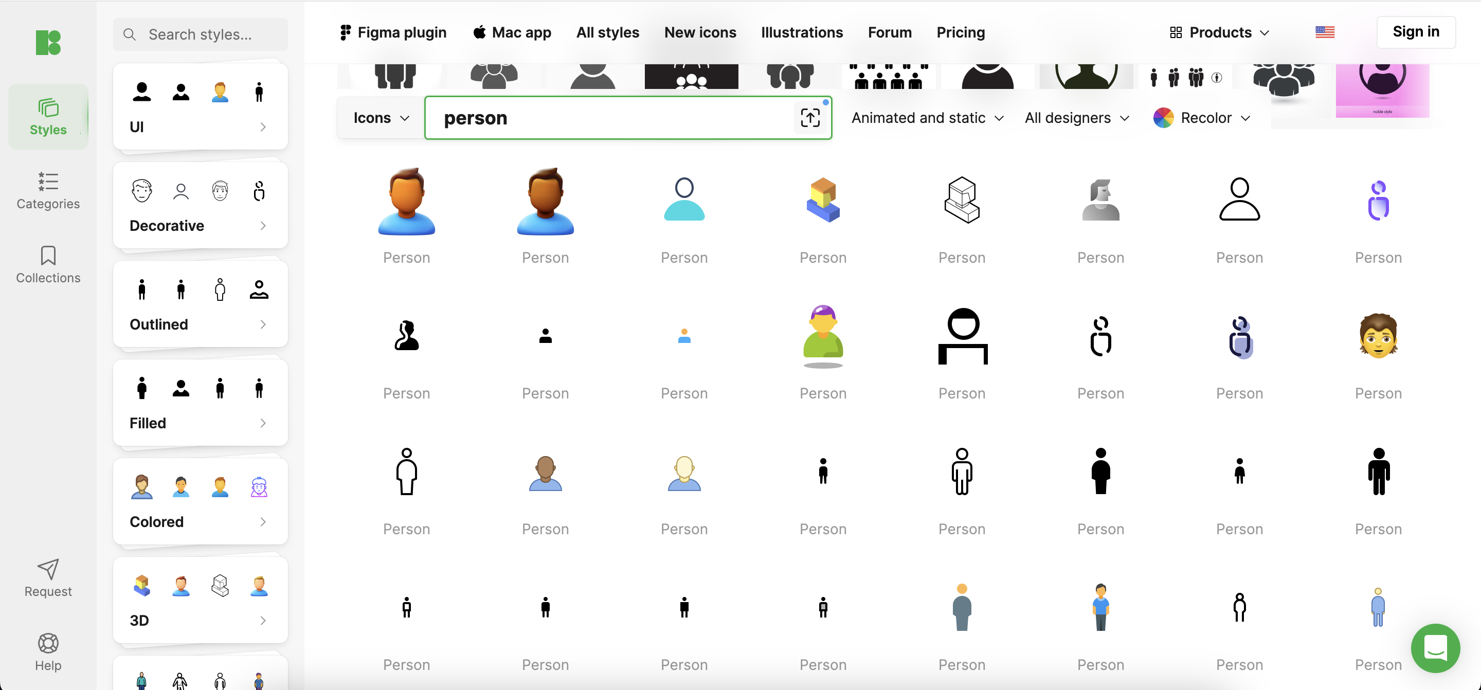
Person icons are pivotal in user interfaces, serving as clear visual symbols that guide user interaction. Crafting effective person icons enhances usability and contributes to the design’s overall cohesion. This guide delves into the best practices for creating compelling person icons, with insights from industry resources, including Icons8.
Understanding the Basics
Person icons symbolize human presence in digital interfaces, vital for features like user profiles, social interactions, and authentication processes. These icons facilitate immediate user recognition and action, underpinning their ubiquity across platforms.
Design Principles for Person Icons
- Simplicity: Maintain simplicity by removing extraneous details to ensure the icon remains recognizable across various resolutions.
- Consistency: Ensure icons align with the application’s visual style and integrate seamlessly into the overall design language.
- Scalability: Design icons that are clear and recognizable regardless of display size, from tiny mobile screens to expansive desktop monitors.
Best Practices in Person Icon Design
- Color Usage: Choose colors that stand out yet are harmonious within the app’s color scheme and function well under various conditions.
- Shape and Form: Opt for simple, rounded shapes that are universally appealing and easy to identify.
- Avoiding Common Mistakes: Avoid overly detailed or ambiguous icons that can diminish functionality, especially on smaller screens or in different cultural contexts.
Cultural Considerations
Designing for a global audience means incorporating diverse cultural elements into icons, ensuring inclusivity. Icons8 offers a range of customizable person icons that can be adapted to reflect different cultures, promoting diversity and inclusivity.
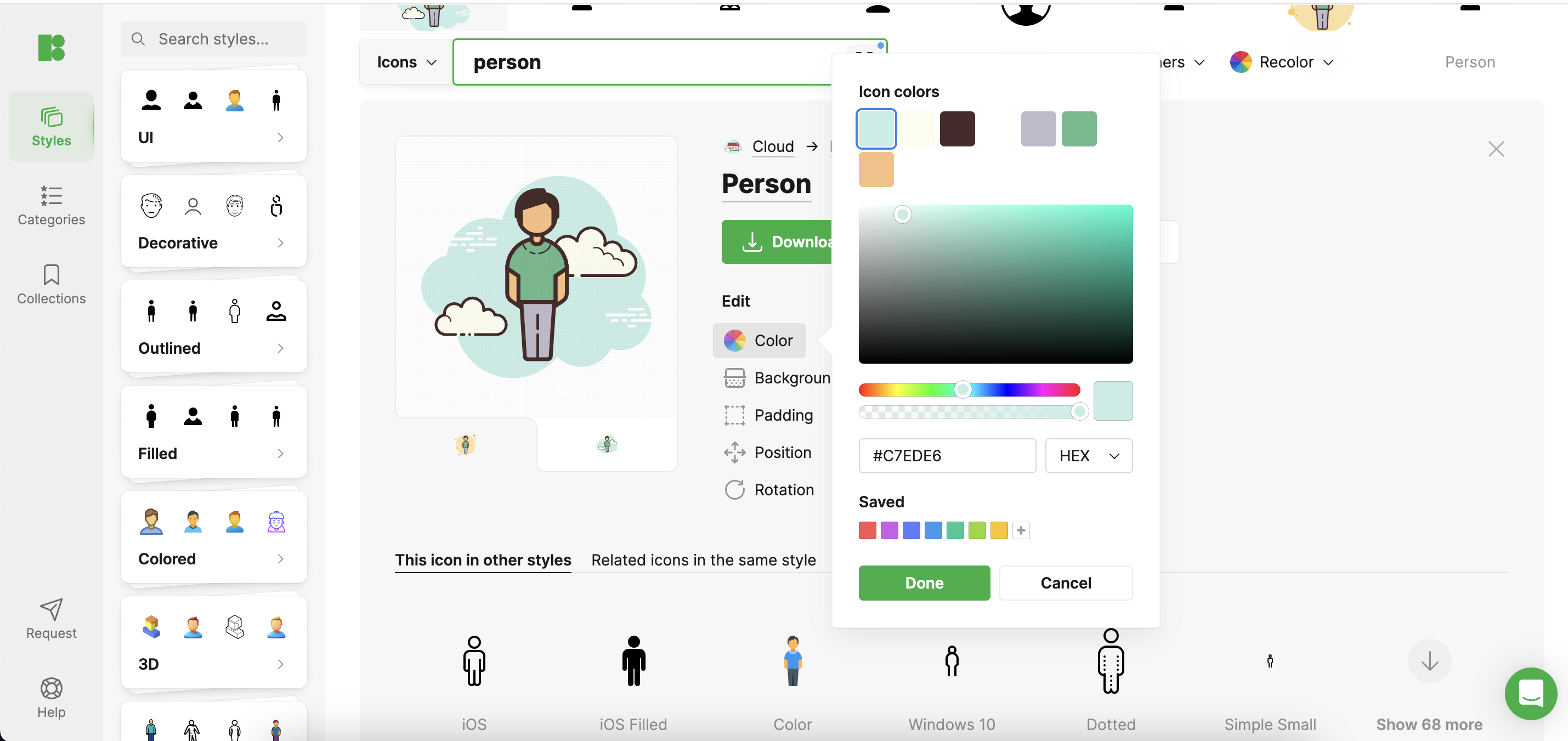
Tools and Resources
Adobe Illustrator and Sketch are the top choices among designers for creating scalable vector icons. Icons8 also provides a variety of design tools and resources that can be particularly helpful, including templates and customizable icons, facilitating the design process and sparking creativity.
Case Studies
Review how platforms like LinkedIn and Instagram utilize person icons to align with their brand and audience expectations. LinkedIn’s professional, simplistic icons contrast with Instagram’s more casual, approachable imagery. Icons8’s blog often features case studies and breakdowns of successful icon implementations, offering further insights and inspiration.
Conclusion
Effective person icons are more than aesthetic elements; they are fundamental to intuitive user interface design. Regularly refining your designs based on user feedback and changing trends is crucial for maintaining their effectiveness.
Further Reading and Resources
Icons8’s blog and resources section provides additional guides and articles that are invaluable for both novice and seasoned designers who want to enhance their skills.
By embracing best practices and utilizing comprehensive resources like Icons8, designers can create person icons that significantly improve user interaction and satisfaction.
Comments are closed.