

User icons are more than decorative elements; they are vital tools that enhance both the user experience and the functionality of custom websites. By guiding users intuitively through interfaces, well-designed icons facilitate smoother interactions and promote a visually appealing, cohesive digital environment.
The Role of User Icons in Web Design
User icons act as essential navigational aids, allowing users to move seamlessly across different sections of a website. An effective icon instantly communicates its function, reducing cognitive load and making the interface more intuitive. For example, a magnifying glass universally suggests search functionality, while a cart icon is synonymous with purchasing. Properly utilized, these icons can significantly enhance the usability and aesthetic of a digital space.
Design Principles for User Icons
- Simplicity and Clarity: Icons should be designed to convey their message or function clearly and without unnecessary complexity. This means avoiding intricate details that can be lost at smaller sizes.
- Consistency: The style of icons should align with the website’s overall design. This includes using a consistent palette, style, and visual weight across all icons to maintain a harmonious look.
- Scalability: Icons must be legible and effective at any size, from large desktop displays to small mobile screens. This ensures that the icons perform their function effectively across all platforms.
Tools and Resources for Icon Design
- Vector Graphics Software: Tools like Adobe Illustrator or Sketch are essential for designing high-quality, scalable vector graphics that stay crisp and clear at any resolution.
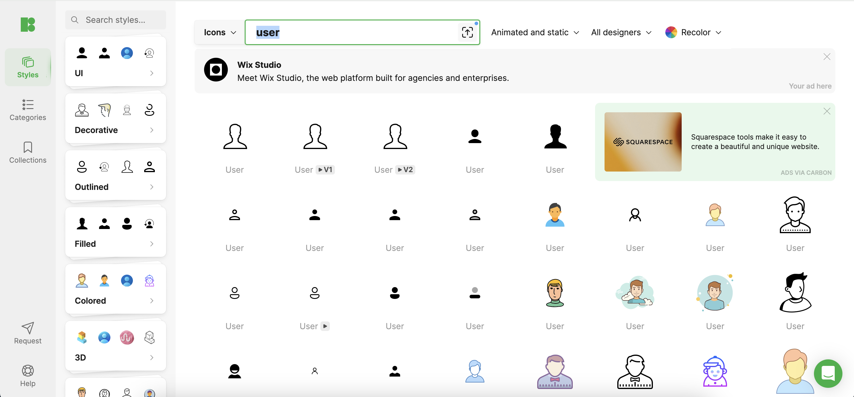
- Icons8: This tool provides a comprehensive library of icons that designers can customize and integrate into their projects. Icons8 ensures that you have access to professionally designed icons that are consistent in quality and style, which can be a huge time-saver.
Best Practices for Custom Icon Creation
- Color Usage: Select colors that not only align with the overall design but also consider the emotional impact of different hues. For instance, green can evoke feelings of growth and comfort, which might be suitable for financial services icons.
- Branding Elements: Incorporating key elements of the brand into icon designs can reinforce the brand identity across the website. This might involve using specific shapes or curves that echo the brand’s logo.
- Accessibility: Make sure that icons are accessible to all users, including those with visual impairments. This involves using adequate contrast, simple shapes, and possibly even text labels for clarity.
Testing and Iteration
- User Feedback: Directly engaging with users to obtain their feedback on icon usability can provide invaluable insights into how these icons perform in real-world scenarios.
- A/B Testing: Experimenting with different versions of an icon on the website can help identify which designs maximize user engagement and ease of use.
- Analytics and Feedback: Regularly reviewing website analytics to understand how changes in iconography affect user behavior allows for data-driven decisions that refine and optimize the user experience.
Conclusion
User icons are a critical component of effective web design, merging aesthetic appeal with functional clarity to foster better user engagement and satisfaction. By utilizing resources like Icons8, designers can access a range of high-quality icons that can be tailored to meet specific needs, ensuring a consistent and professional look across the website. A thoughtful approach to icon design, combined with ongoing testing and refinement, will lead to a more intuitive and attractive digital interface.
Comments are closed.