
Obama’s campaign was a hit. Probably for the first time in history of presidential campaigns, all design elements were executed at a high level of professionalism. This probably played a great role in the overall success.
Starting from the identity most of the communication elements were executed with great skill and good taste. Let’s see a few interesting items from his campaign.
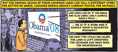
Illustration by Ward Sutton for The New York Times.
Notice how well the logo mutates to communicate to different segments of the society.


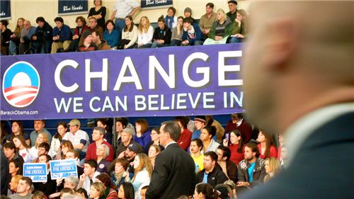
Banner with “Change We Can Believe In” is written in Obama’s signature ‘Gotham’ typeface.
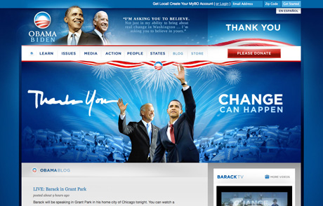
The website barackobama.com was the centerpiece of the campaign, and it was praised for it’s clarity, great design and frequent updates. Perfect example of a well executed web 2.0 site.
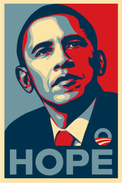
The artists for Obama campaign resulted in numerous iconic designs. Especially the world famous illustration by Shepard Fairey.
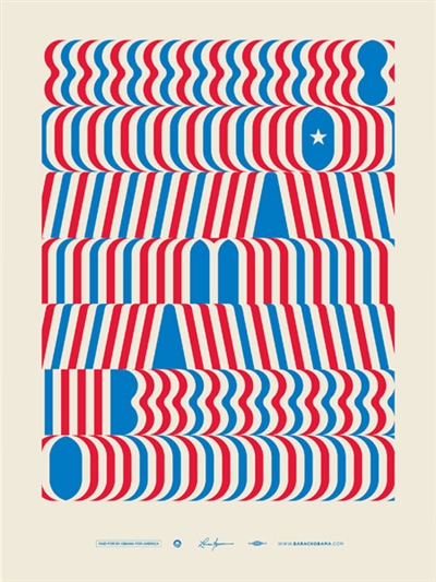
Poster by Lance Wyman.
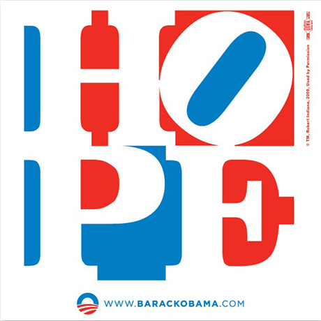
Poster by Robert Indiana.
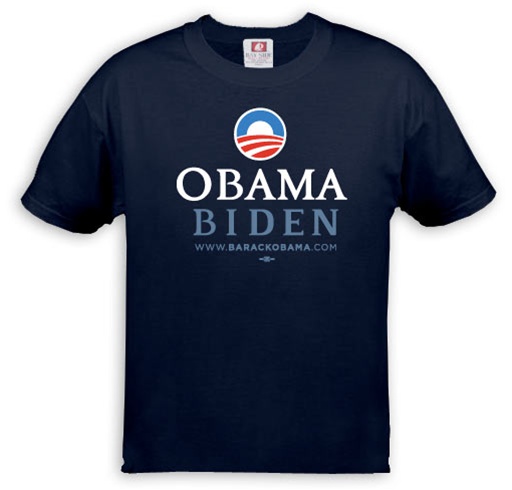
Even the merchandise is typographically solid.
Grassroot actions were prominent throughout the campaign, like this sticker placed on traffic lights.
The campaign wasn’t all positive. Although it wasn’t initiated by Obama’s team directly, people did make fun of the opponent.There was a bit of Palin bashing going on.
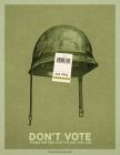
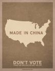
Here is an unofficial campaign from the Obama camp urging people to Vote.
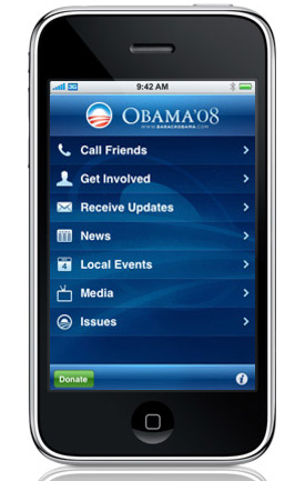
The campaign extended to new media such as the much praised iPhone application.
Watch how the identity came through in video as well.
Finally listen to Yes We Can.
Can’t get enough of Obama? Create your own Obama logo.
Comments are closed.