

Close icons are a staple in app design, serving as navigational aids that allow users to exit views or dismiss dialogues efficiently. Yet, as user interfaces evolve, there’s a growing need to move from basic close icon designs to more bold and innovative ones. This transition can enhance user engagement and elevate the overall aesthetic of an app, with tools like Icons8 offering a plethora of resources to inspire and implement these designs.
The Basics of Close Icon Design
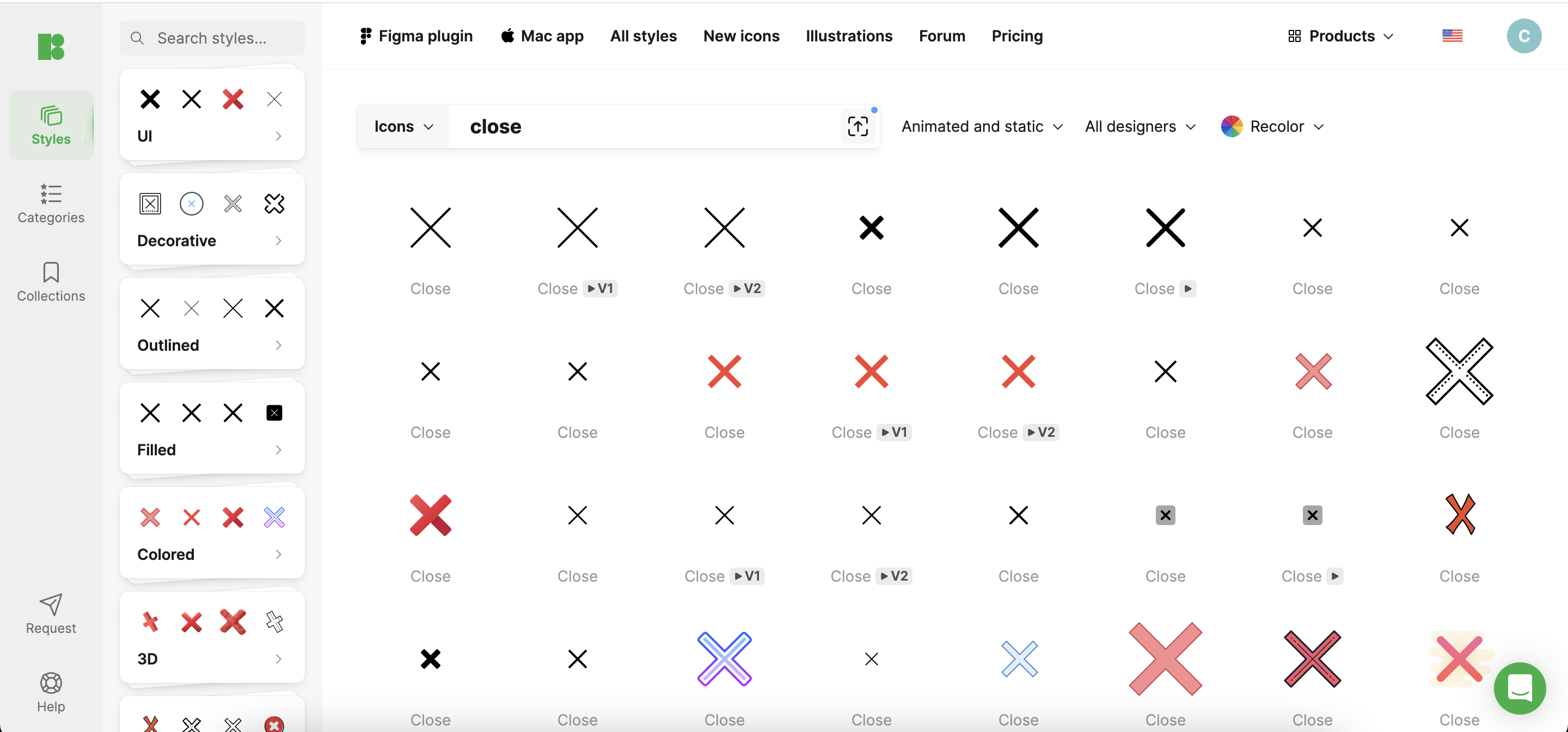
At its core, a close icon must be visible, accessible, and functional. Traditionally, these icons have been simple, often represented by a cross (‘X’) or a minus sign. While effective, these standard symbols can sometimes blend into the background, particularly in complex app interfaces. Icons8 provides a variety of icon styles that can serve as a starting point for more dynamic designs.
Challenges with Standard Close Icons
Standard close icons, while reliable, often fail to capture the user’s attention, potentially leading to a mundane user experience. Furthermore, typical pitfalls include icons that are too small, poorly contrasted against their background, or ambiguously designed, which can confuse users and detract from usability. Icons8 offers high-contrast, clearly distinguishable icons that can help overcome these challenges.
Innovative Design Techniques
To break away from the norm, consider these innovative approaches:
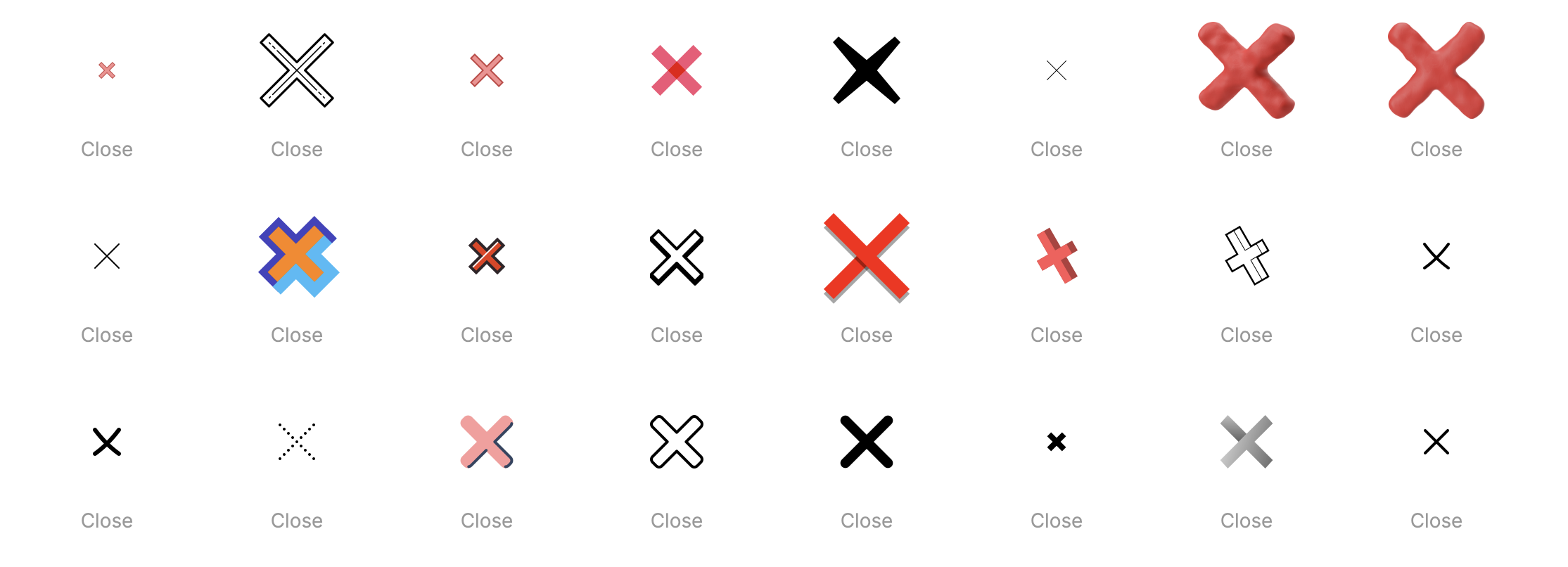
- Creative Shapes and Symbols: Look beyond the traditional ‘X’ to arrows or thematic symbols aligning with your app’s content. Icons8 features an extensive library of unique symbols that can be adapted for close icons.
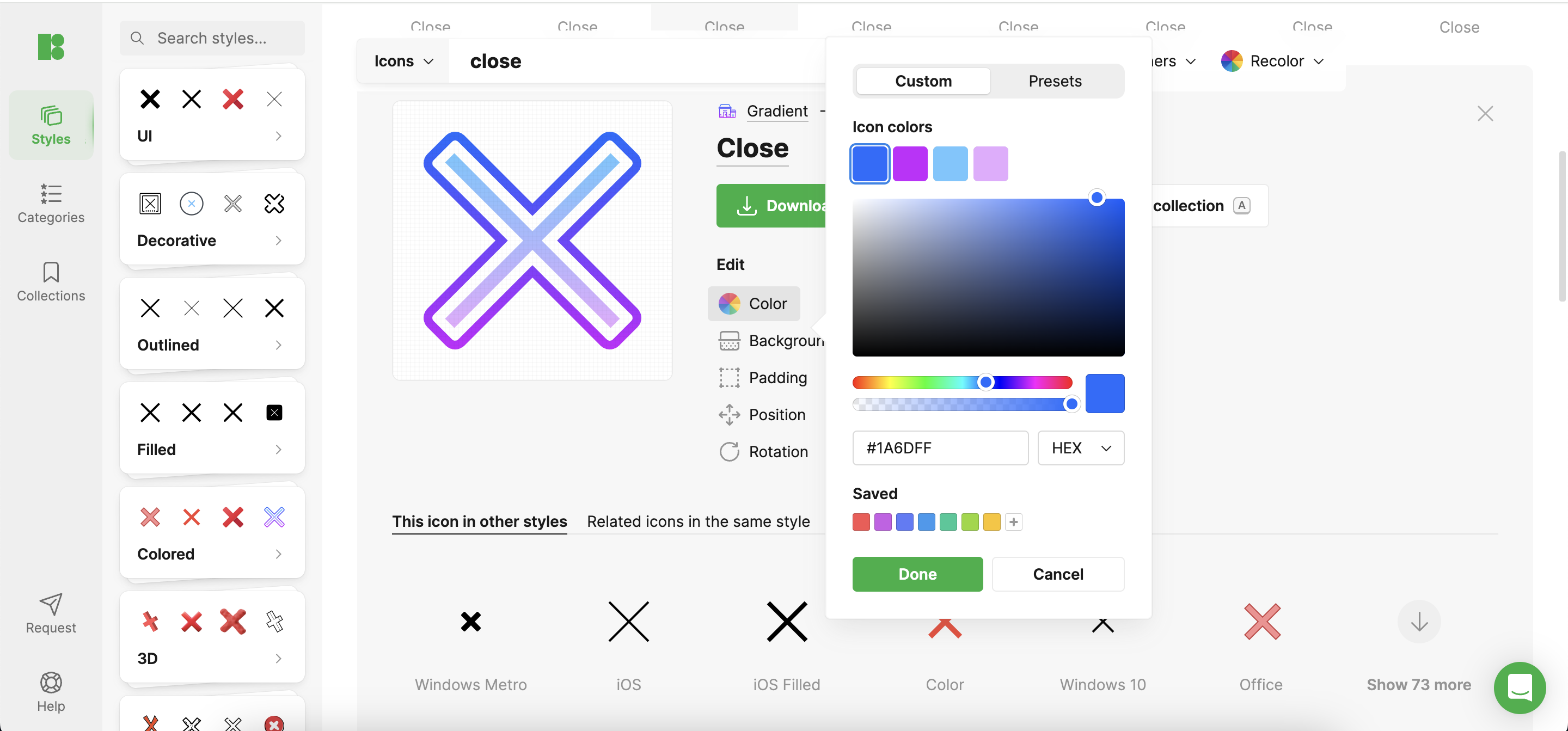
- Color and Size: Use bold colors and larger sizes to make the close icon stand out. Icons8 provides customizable icons in various colors and sizes, allowing easy integration into any app design.
- Dynamic Elements: Adding animation or interactivity, such as hover effects or a change in color when touched, can make closing an engaging action rather than a purely functional task. Icons8’s animated icons can add this layer of interaction to your design.
Case Studies: Bold Close Icon Implementations
Innovative close icons have been successfully integrated into various apps. For example, a music app might use a dynamic equalizer symbol from Icons8 for its close icon. This symbol animates when hovered over, adding an element of fun and maintaining the app’s creative feel. Such designs enhance the interface and improve user engagement by providing a memorable interaction.
Designing for Different Platforms
When designing close icons, it’s crucial to consider the platform. Icons8 offers platform-specific icon designs optimized for mobile, tablet, and desktop use, ensuring that the icon functions well within each device’s user interface and user habits.
User Testing and Feedback
Bold designs should be user-tested extensively to gauge their effectiveness. Icons8’s tools allow for rapid prototyping and testing, enabling designers to iterate based on user feedback quickly, refining the design to ensure it looks good and enhances the user experience. Techniques like A/B testing can reveal which designs perform better in terms of usability and user satisfaction.
Best Practices for Bold Close Icon Design
When venturing into bold designs, maintain a balance between creativity and functionality. Ensure that the icon is still recognizable as a close button and that it complements the app’s overall design. Icons8 can help maintain this balance with its wide range of design options that emphasize style and functionality.
Conclusion
Evolving from basic to bold close icon designs offers an opportunity to inject creativity into your app’s user interface. Icons8 provides the tools and resources necessary to explore and implement these innovative designs, enhancing not just the look but also the functionality of your app.
Call to Action
App designers, challenge yourselves to rethink and rejuvenate your close icons. Utilize resources like Icons8 to explore a variety of designs and user feedback tools. Remember, the goal is to create icons that are not only visually appealing but also improve the overall user experience.
Comments are closed.