

Menu icons are a staple in user interface design. They serve as both navigational aids and elements enhancing the visual appeal of digital products. Their role in guiding users and enriching the overall user experience cannot be understated.
Understanding Icon Functionality
Menu icons are graphical elements that facilitate user interaction with app functionalities without cluttering the interface with text. They are especially crucial in mobile environments where space is limited, making efficient use of visuals imperative for usability.
Best Practices in Menu Icon Design
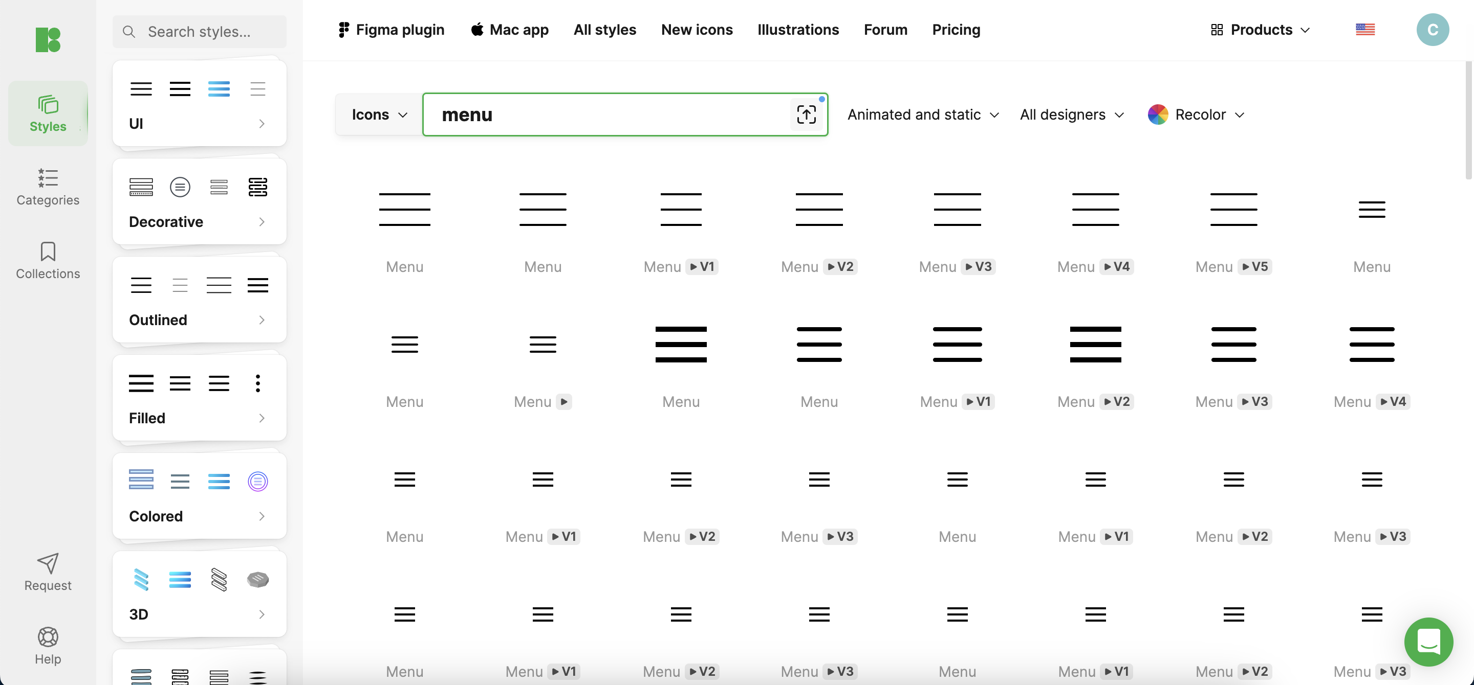
- Clarity and Simplicity: The primary goal of a menu icon is immediate recognition. Icons should be simple and iconic enough that their meaning is unmistakable, even at a glance. Overly complex icons can lead to confusion, detracting from user experience. For instance, a ‘hamburger’ icon effectively communicates “menu” and is widely understood due to its simplicity and frequent use.
- Consistency: Uniformity in style, size, and color of icons ensures that users can navigate your interface intuitively. Consistent icons function predictably, enhancing user trust and reducing cognitive load. This means once a user learns what one icon does, they can infer the functionality of others if they are consistently designed.
- Cultural Considerations: When designing menu icons, consider the diverse cultural interpretations of imagery. An icon that is clear in one culture may be ambiguous or offensive in another. Aim for universal symbols and test them across different demographic groups to ensure broad comprehensibility.
Technical Aspects of Creating Menu Icons
- Size and Scaling: Icons must be legible in different sizes and resolutions, especially with the proliferation of devices with varying screen densities. Typical sizes vary, but maintaining a consistent aspect ratio and resolution independence ensures usability across all platforms.
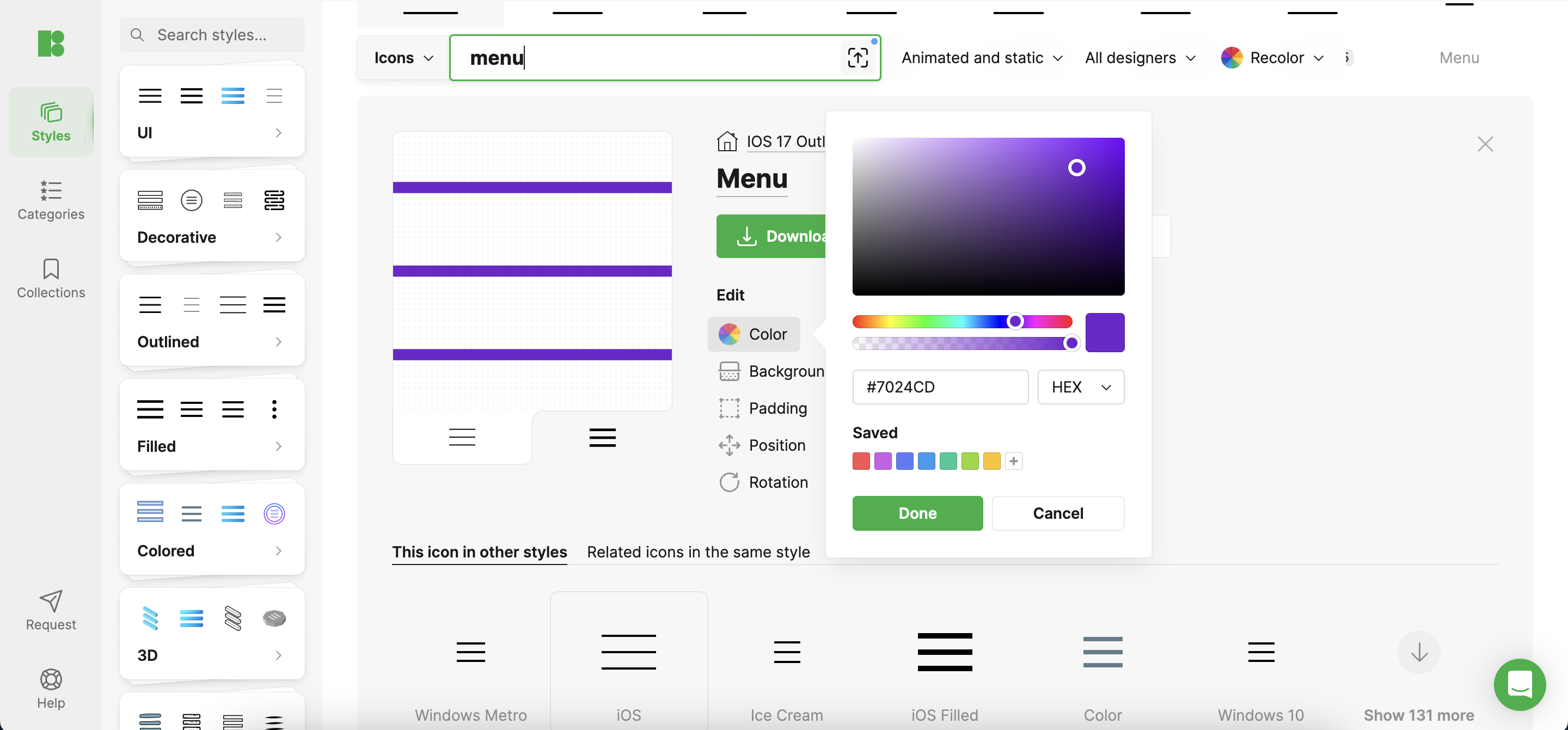
- Color and Contrast: Color choices should complement the overall design palette, standing out enough to draw attention. High contrast between icons and their backgrounds is critical, not just for aesthetics but also for accessibility, ensuring that users with visual impairments can navigate easily.
Testing and Feedback
Iterative testing with real users is crucial. Observe how users interact with your icons and gather feedback to refine their design. This could involve A/B testing different icon designs to determine which are most effective in real-world applications.
Case Studies
Consider Instagram’s evolution of its camera icon, which has become simpler over the years while remaining recognizable. This refinement process illustrates the importance of adapting icon designs to maintain user familiarity and improve visual harmony as design trends evolve.
Conclusion
Designing effective menu icons is a blend of art and science. By adhering to best practices in clarity, consistency, and technical execution and by continually iterating based on user feedback, designers can create intuitive and attractive icons that enhance the navigation experience.
Additional Resources
For a comprehensive collection of icons designed with these best practices in mind, check out Icons8, which offers a wide array of ready-to-use icons and design tools suitable for enhancing any project.
Comments are closed.