 I came across a very interesting research which will help web designers tremendously to make the most out of the content with design. Here are the learnings in a nutshell:
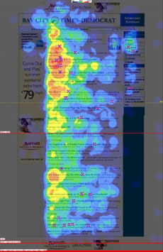
The eyes most often fixated first in the upper left of the page, then hovered in that area before going left to right. Only after perusing the top portion of the page for some time did their eyes explore further down the page.
Navigation placed at the top of a homepage performed best.
Dominant headlines most often draw the eye first upon entering the page — especially when they are in the upper left, and most often (but not always) when in the upper right. A headline has less than a second of a site visitor’s attention. For headlines — especially longer ones — it would appear that the first couple of words need to be real attention-grabbers if you want to capture eyes.
People look at blurbs under headlines on news homepages, they often only look at the left one-third of the blurb. Smaller type encourages focused viewing behavior (that is, reading the words), while larger type promotes lighter scanning. Eyes typically scan lower portions of the page seeking something to grab their attention. Shorter paragraphs performed better in Eyetrack III research than longer ones. The standard one-column format performed better in terms of number of eye fixations.
We found that ads in the top and left portions of a homepage received the most eye fixations. Close proximity to popular editorial content really helped ads get seen. Text ads were viewed most intently, of all the types we tested. Size matters. Bigger ads had a better chance of being seen.
We also learned that the bigger the image, the more time people took to look at it. Our research also shows that clean, clear faces in images attract more eye fixations on homepages. Participants were more likely to correctly recall facts, names, and places when they were presented with that information in a text fomat. However new, unfamiliar, conceptual information was more accurately recalled when participants received it in a multimedia graphic format. Story information about processes or procedures seemed to be comprehended well when presented using animation and text.
One thing that surprised me is that smaller fonts encourage reading. Were you surprised at any of the findings?
Commenting on this Blog entry is closed.

Comments are closed.